VkusResurs is a B2B ingredient supplier.
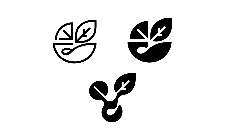
(01) Among the brand’s values are quality, speed, and stability. The design must communicate the company’s reliable interaction with the client, evoke trust, and feel dynamic. The first concept is an illustrative, minimalist logo embodying the concept of connection, including the connection between two key components («taste»
and «resource»).
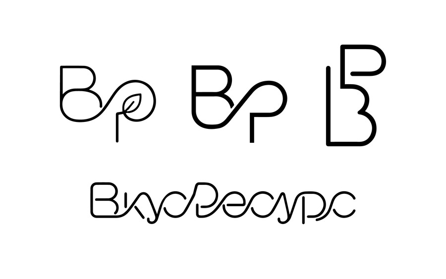
(02) The logotype is constructed using a unified line that flows sequentially through all the logo elements. This technique symbolizes a stable connection between the company, its partners, and its clients, as well as the continuity of workflows. Subtle breaks enhance the legibility of the mark while preserving a visual rhythm without compromising the sense of wholeness.
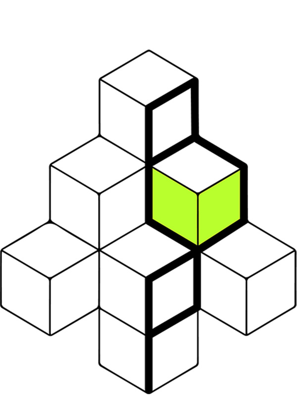
(03) The sign is built upon modular geometry: several elements combine to form a single, stable structure, which reflects the brand’s principles—systemicity, reliability, and building strong connections between participants in the process. The modules symbolize both individual ingredients and resources, as well as components of a logistics network that, by connecting, create an efficient supply system.
Final Logo