Original size 1140x1600

Brewed at XPOM

PROTECT STATUS: not protected

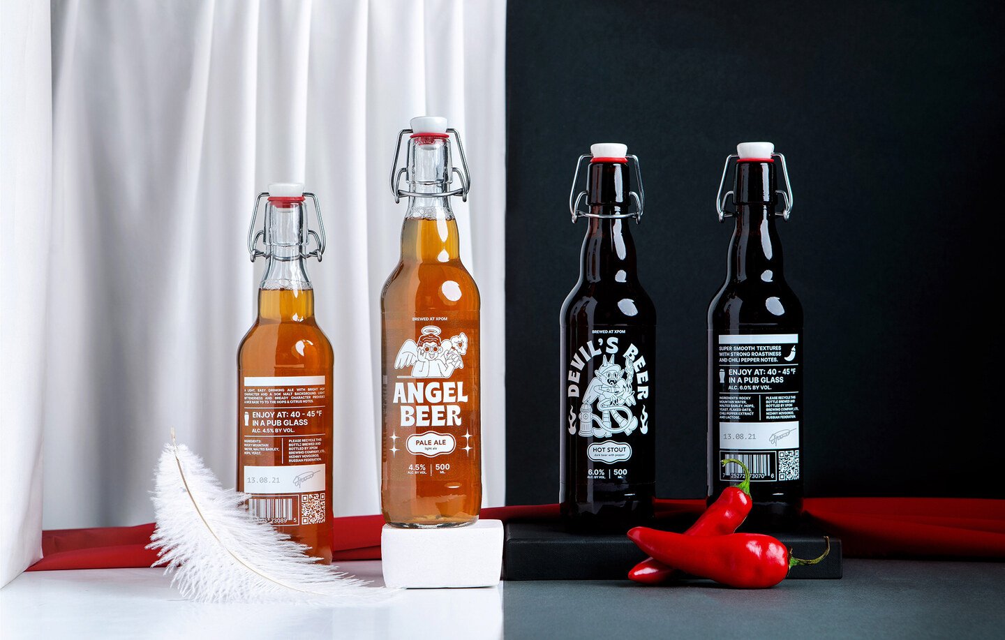
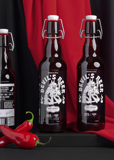
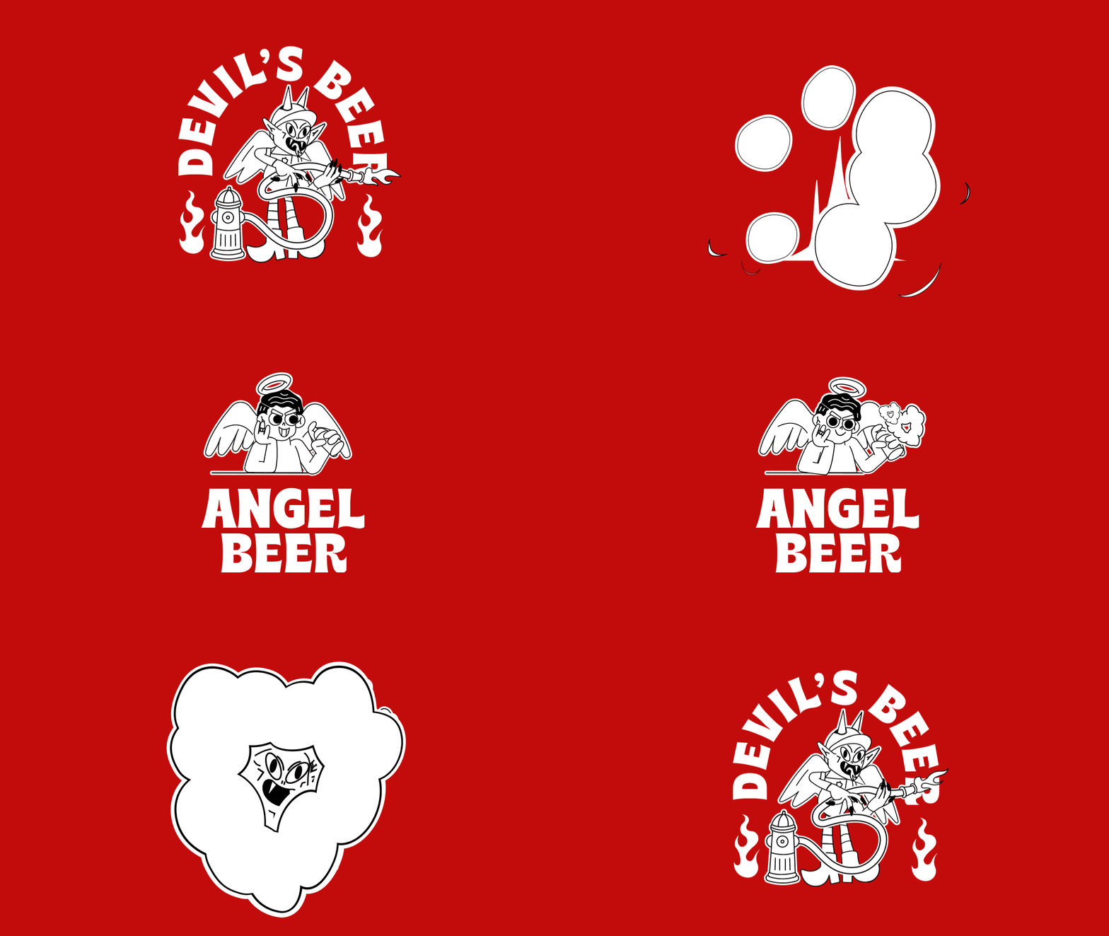
Label concept for limited edition craft beer. The idea is based on the division of beer varieties into light and dark, like the confrontation between the Angel and the Devil. «Angel beer» — Pale Ale, for those who choose the bright side. «Devil’s beer» — Hot Staut with pepper for lovers of spicy dark.

Collaboration between Chrome Studio and Costa Rican illustrator Anthony Orozco. In his work, Anthony focuses on experimentation in creating unique character designs. He also loves typefaces and combines them with illustration, explores space and composition while keeping the color palette as reduced as possible. As part of the project, the color in the labels was completely removed and the line was divided due to the color of the beer. And the shape of the bottle with a lock-cap emphasizes the craftiness of the line.

And which side will you choose?
big
Original size 1280x720
big
Original size 1920x1222
Original size 1920x1281
Original size 1920x1288
Original size 1920x1252
Original size 1920x1281
Original size 909x1111
Original size 1400x1000
Brewed at XPOM
Григорий Хромов разработал концепцию этикетки для ограниченной серии крафтового пива «Brewed at XPOM». Проект включает разделение сортов пива на светлые и тёмные, визуально отражающее противостояние Ангела и Дьявола.
Project description created with AI
Project created at 18.05.2023
More projects in packaging design
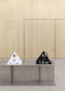
Светлана Алексеева создала дизайн упаковки для походных товаров, сочетающий современные обозначения и эвенкийские символы. Проект включает упаковку палатки, снэков и спичек, а также рекламную кампанию, отражающую чистоту природы и локальную культуру.
Упаковка для пасхальных куличей
46
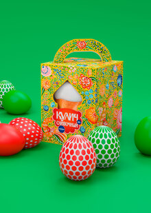
Светлана Себякина и команда создали упаковку для пасхальных куличей, вдохновлённую городецкой росписью. Дизайн включает уникальное леттеринговое решение, основанное на старославянских шрифтах.
Layer
Layer
107
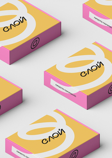
Авторы Елена Пантюхина и Алексей Пушков создали фирменный стиль для бренда «Слой», который объединяет пекарни и новую школу выпечки. Проект включает логотип с наклоном, метафорический завиток и цветовую палитру, вдохновлённую начинкой выпечки.
lpudesign
LPU — Lovely Professional University, India’s Best Private University in Punjab. A university with the infrastructure of global standards, internationally benchmarked curricula, rich diversity of students, innovative pedagogy for participative and experiential learning with focus on research, innovation and entrepreneurship
design
object design
art
fashion
environment
game design
illustration
animation
cgi
sound