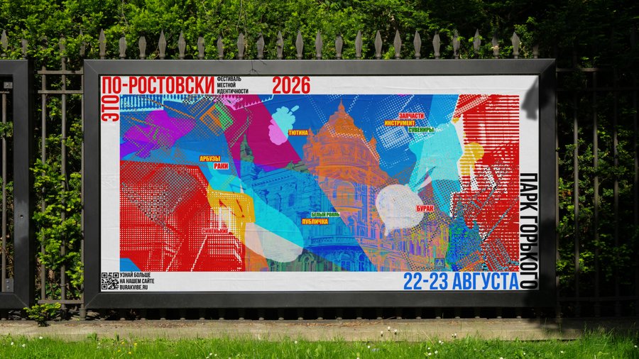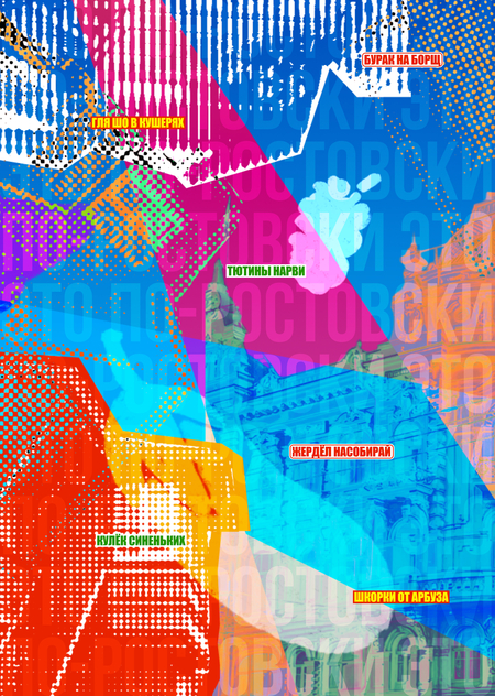
This is the Rostov flavor of a festival centered on the vibrant, authentic character of the city and its residents.
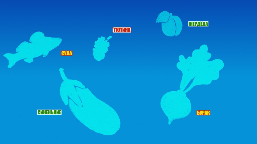
The identity is rooted in three distinctive traits: mixed architecture, the Southern dialect, and inexpensive signage. Why? Only in the center of Rostov can you, with just one step from a stately Baroque facade, enter a decidedly residential, overgrown courtyard with questionable additions. The Rostov resident is recognizable in other regions by calling the Tutina instead of Shelkovitsa, Burak instead of beet, Sinyonkim instead of eggplant, Zherdyole instead of apricot, and Sule instead of pike-perch. Moreover, the city’s alleys are still filled with characteristic signage, despite the rapid pace of branding development among local entrepreneurs.

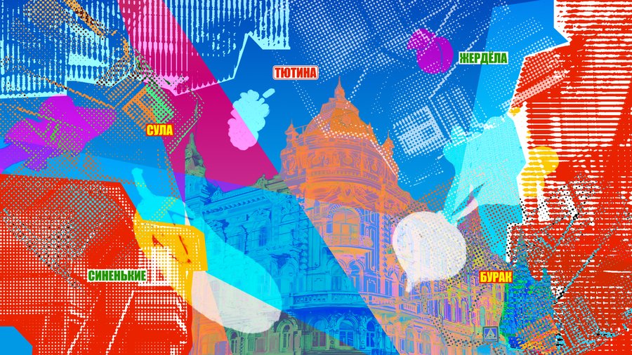
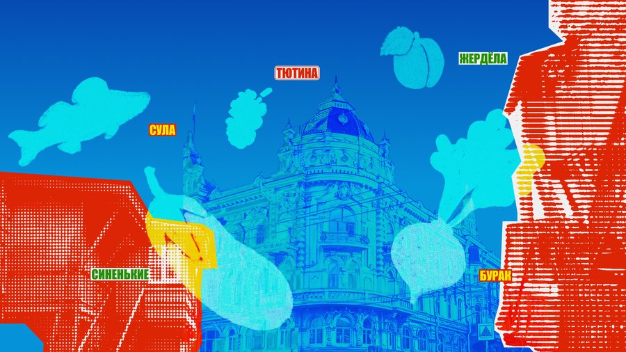
Vibrant colors, raster image manipulation, and a grunge aesthetic in the identity lend Rostov its distinctive heat, unique character, and a touch of rebellion.